


Google continues to make changes that affect how mobile websites appear in the search results. Its latest change—dubbed Mobilegeddon 2.0—goes live this month. Here’s what that means for your small business website.
On April 21, 2015, Google made a change in their search algorithm that determined how it ranks websites in mobile search. On that day, Google started using “mobile-friendly” as a ranking signal.

Here’s what that means in plain English. When someone searches Google on a mobile phone, websites that are mobile-friendly may appear above those that aren’t.
{{cta(‘d27b09ba-948c-4807-af9a-2f5ea8e3aff4’)}}
April 21 was dubbed “Mobilegeddon” because dire consequences were predicted for sites that weren’t optimized for mobile. Yet, despite the hype, the effect on rankings was less dramatic than expected.
Natural Selection Rather than Extinction
Although it came and went with a whimper, the Mobilegeddon update was the beginning, not the ending. In March of this year, Google reaffirmed its ongoing mission to make the web more mobile-friendly:
Today we’re announcing that beginning in May, we’ll start rolling out an update to mobile search results that increases the effect of the ranking signal to help our users find even more pages that are relevant and mobile-friendly.
Rather than the mass extinction that was predicted, non-mobile websites—and possibly the businesses that own them—will suffer a slow death through natural selection, as they fail to adapt to the rapidly changing digital world.
Adapt or Die
Will your business really face extinction if your site isn’t mobile-friendly? Keep in mind that Google isn’t the only one penalizing you for your non-mobile website.
61% of smartphone users will abandon your non-mobile website for a competitor’s whose is

Google: What Users Want Most From Mobile Sites Today, 2012
All things being equal, if your website isn’t mobile-friendly and your competitor’s is, you lose.
Is My Site Mobile-Friendly?
Most business owners can’t answer that. But it’s really simple. You can test if your site is mobile-friendly here. If it fails, you’ll see this:

Free Guide
A mobile-friendly website is just one of several factors that affect how high you appear in the search engines. Download our free guide to learn about the rest.
{{cta(’28e6e571-9166-4084-9daa-a65747fc58f7′)}}
About the Author

Ashley Williams
Since 1932, Haines has been publishing the original Criss Cross directory. Now, instead of a giant book, we deliver the same great information in a digital format. We are a family-owned, certified women-owned business led by me as our first female, fourth-generation CEO. Our Criss+Cross Directory is nationally recognized for delivering essential residential and property data. We serve diverse clients — from government agencies to real estate professionals, mortgage companies, investors, contractors, and more
Want to Get More Tips from Haines? Subscribe to Our Blog
Recent Posts

7 Lead Generation Technologies You Should Be Using
The landscape of customer acquisition has fundamentally shifted. Cold calling […]
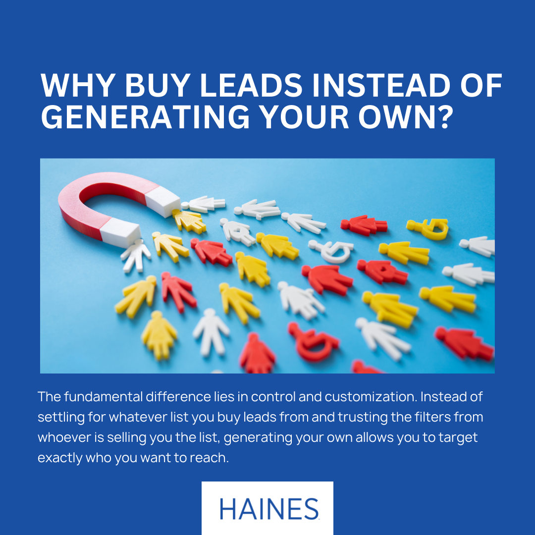
Why Buy Leads When You Can Generate Your Own Lead Lists?
In today’s competitive business landscape, the age-old question persists: Should […]
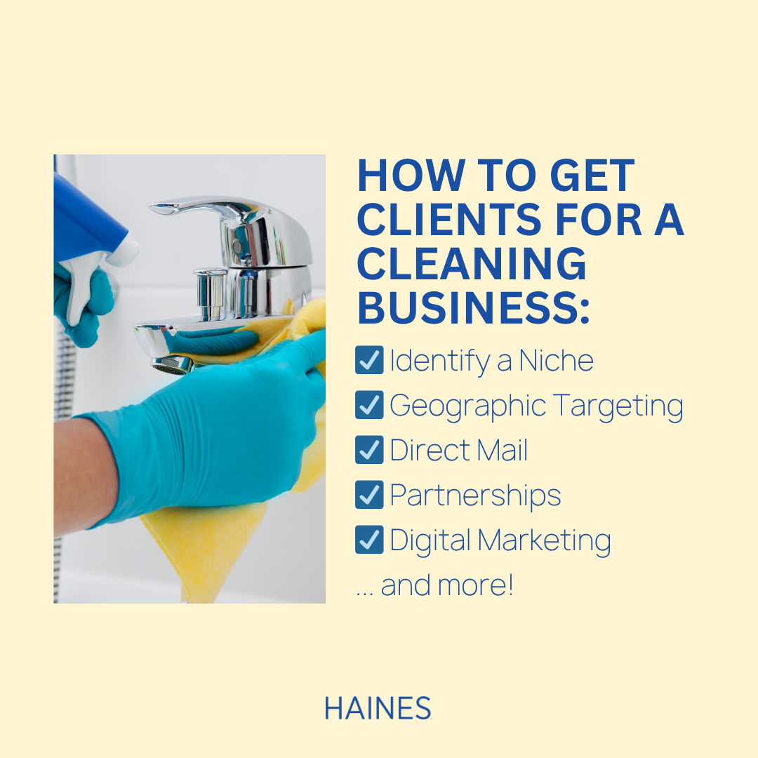
How to Get Clients for a Cleaning Business
Understanding how to get clients for a cleaning business is […]

How to Build Prospecting Lists That Will Convert
Building effective prospecting lists is the cornerstone of successful sales […]

How to Get Clients as a Financial Advisor
Understanding how to get clients as a financial advisor is […]

The Ultimate Guide to Mortgage Lead Generation for Loan Officers
In today’s competitive mortgage industry, consistent mortgage lead generation separates […]
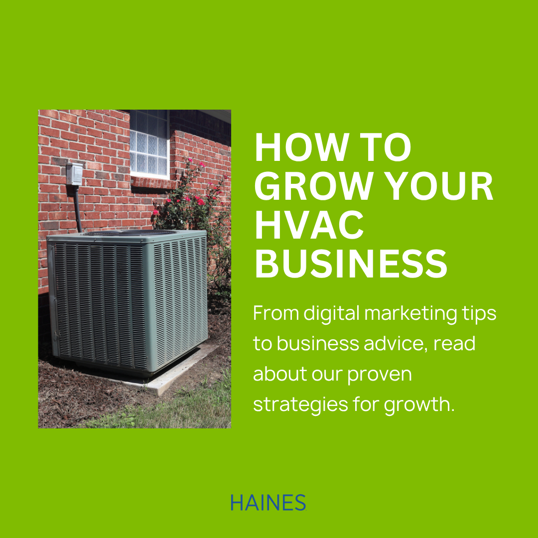
How to Grow Your Heating and Air Conditioning Business
The heating, ventilation, and air conditioning (HVAC) industry presents tremendous […]

Prospecting Leads: A How-To Guide to Finding the Right Clients
Prospecting leads is one of the most critical tasks for […]
Testimonials

Michele McAuliffe
AAA Green Builders
Our company is trying to get back on our feet after COVID-19. We are an established construction company and for many years, we have utilized Haines for our lists and have always had good results. Recently, we purchased a custom list and we’re able to convert those prospects into customers, we could not have done it without you. We are growing as a company again and we really rely on good listings.
We appreciate your excellent customer service and we are really happy with our results.
Stephanie
First National Title & Escrow
Haines had been a breath of fresh air! They have been amazing to work with over the last 20 years. I will always be a loyal client!
Lila Wohlwend
Clear Sky Realty
I would recommend this to anyone involved in the real estate industry who wants access to a system that will help them in their business. We use Haines frequently and have for years. It’s a great database!
D.D. Castillo
Triolo Realty Group
We have been using Haines Criss Cross for years! Its data is the lifeline of our prospecting to help us find new residential real estate listings and narrow down specific farm searches for targeted buyer searches. Their customer service and training is always helpful at answering questions and recommending new strategies. Would highly recommend it!